If you’ve ever typed “make it look like anime” (or “make it cinematic” or “make it watercolor”) into an AI image tool and gotten something… not quite right, you’re not alone.
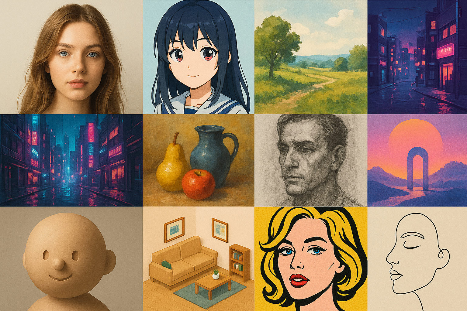
The tricky part is that “AI art styles” can mean a few different things:
a medium (watercolor, oil painting, charcoal)
an aesthetic (cyberpunk, vaporwave, cottagecore)
a technique (pixel art, low-poly 3D)
an art movement (Art Nouveau, surrealism)
Once you know which bucket you’re reaching for—and how to describe it—you can get better results with shorter prompts, fewer rerolls, and way less frustration.
This guide walks through the most useful style families beginners should know (in other words: popular AI art styles), plus simple prompt starters you can copy and customize.
A quick way to choose an AI art style
If you’re not sure where to start, use this 30-second filter:
What are you making? (portrait, landscape, product shot, character, logo-like graphic)
Do you want it to look like a photo? If yes, start in Photo-like styles.
Do you want it to look illustrated? If yes, pick a line/painting style (anime, comic, watercolor).
Do you want a specific vibe? (cozy, futuristic, eerie, dreamy)
Do you want texture? (paper grain, brush strokes, film grain, clay)
Pro Tip: When you’re new, choose one main style (your “north star”), then add 1–2 “accent” descriptors (lighting + color palette). Mixing five styles at once usually averages into mush.
A beginner prompt template that works across styles
If you’ve been skimming an AI art styles list and wondering why your images don’t match what you saw, the difference is usually prompt structure—not some secret setting.
Most generators respond well when you describe your image in layers. You can think of it like ordering a drink: you start with the base, then you specify the flavor.
Here’s a simple template you can reuse (it’s a great baseline for AI art prompts):
Subject + style/medium + lighting + color palette + composition + details
Example (swap the style words to change the look):
“A red fox sitting in a snowy forest, watercolor painting, soft overcast light, muted cool blues and warm oranges, wide shot, textured paper grain, high detail”
For more prompting “ingredients,” Zapier’s roundup of AI art styles you can use in prompts is a helpful menu of style words and visual modifiers.
Photo-like styles (when you want realism)
1) Photorealistic
What it is: An image that aims to look like a real photograph.
What it looks like: Natural skin texture, believable lighting, realistic depth of field, camera-like imperfections.
Best for: Headshots, product photography mockups, lifestyle images.
Prompt starter:
“Close-up portrait of a cyclist, photorealistic, 85mm lens, soft window light, shallow depth of field, natural skin texture”
Common failure mode: “Plastic skin” or uncanny faces. Fix it by asking for natural skin texture and soft light instead of harsh studio lighting.
2) Hyperrealistic
What it is: Like photorealism—but pushed “beyond real” with extra detail and intensity.
What it looks like: Ultra-crisp pores and fabric, dramatic lighting, heightened contrast.
Best for: Concept art that still feels real, dramatic portraits, cinematic posters.
Prompt starter:
“A rain-soaked street at night, hyperrealistic, high contrast, neon reflections, ultra-detailed textures, cinematic framing”
Common failure mode: Over-sharpened, crunchy details. If it looks too harsh, lower the intensity: ask for soft contrast or film grain.
If you’re curious about where the line is, TheCollector’s explainer on photorealism vs hyperrealism is a clear primer.
3) Cinematic film still
What it is: A photo-like look that borrows from movie lighting and color grading.
What it looks like: Intentional shadows, moody highlights, teal-and-orange or muted grading, widescreen framing.
Best for: Thumbnails, posters, storytelling scenes.
Prompt starter:
“Two friends in a diner at midnight, cinematic film still, 35mm, shallow depth of field, moody practical lights, subtle film grain”
Common failure mode: Generic “movie look.” Make it specific: name the time of day, light sources (neon sign, candlelight), and camera lens.
4) Black-and-white photography
What it is: Photo realism without color.
What it looks like: Strong lighting relationships, texture-first images, timeless mood.
Best for: Portrait studies, architecture, street photography vibe.
Prompt starter:
“Street portrait of an elderly man, black and white photography, high dynamic range, rim light, sharp focus”
Common failure mode: Flat gray images. Fix it by specifying high contrast and a clear light direction.
Anime, manga, and cartoon styles (when you want characters)
5) Anime
What it is: A broad umbrella for Japanese animation-inspired character illustration.
What it looks like: Expressive eyes, clean linework, stylized proportions, vibrant shading.
Best for: Avatars, character art, fan art-inspired portraits.
Prompt starter:
“A young witch holding a lantern, anime style, clean line art, soft cel shading, warm glow lighting, detailed background”
Common failure mode: Faces that don’t match the vibe you want (too childish, too realistic). Fix it by adding an age/mood cue: teen protagonist, adult, cute chibi, serious tone.
If you’re starting from an existing photo and want a cinematic anime look, you can try Photo Editor AI’s Ghibli Style Converter as a quick way to see how style transfer behaves on real faces.
6) Manga
What it is: Japanese comic-style illustration.
What it looks like: High-contrast ink lines, screentone shading, graphic panels, dramatic expressions.
Best for: Poster-style art, character close-ups, black-and-white graphic looks.
Prompt starter:
“A detective in the rain, manga ink drawing, heavy linework, screentone shading, dramatic shadows, close-up”
Common failure mode: Muddy mid-tones. Fix it with high contrast inks and clean linework.
7) Western cartoon
What it is: Simplified, exaggerated illustration common in Western animation.
What it looks like: Bold outlines, flatter shading, playful proportions.
Best for: Stickers, social icons, friendly brand mascots.
Prompt starter:
“A smiling cactus wearing sunglasses, cartoon illustration, thick outlines, flat colors, simple background”
Common failure mode: Too much detail. If it stops feeling “cartoon,” remove complexity: simple shapes, flat colors, minimal background.
8) Chibi
What it is: An extra-cute, super-deformed character style.
What it looks like: Big head, tiny body, simple facial features.
Best for: Emotes, profile icons, cute stickers.
Prompt starter:
“Chibi astronaut waving, kawaii chibi, pastel palette, clean outlines, simple shading”
Common failure mode: Creepy-cute. Fix it by keeping the face simple and avoiding hyper-detailed skin.
Illustration styles (clean, modern, and flexible)
9) Flat vector illustration
What it is: Clean shapes and solid colors, like modern UI/brand illustrations.
What it looks like: Minimal gradients, crisp edges, simplified anatomy.
Best for: Blog graphics, explainer visuals, icons.
Prompt starter:
“A person watering a houseplant, flat vector illustration, simple shapes, pastel palette, minimal shadows”
Common failure mode: Too much texture. Remove it: no grain, no brush texture, clean vector edges.
10) Line art
What it is: Drawing defined mostly by outlines.
What it looks like: Minimal shading, elegant contours.
Best for: Tattoos, logos, minimalist posters.
Prompt starter:
“A profile of a cat, minimal line art, single continuous line, white background”
Common failure mode: Wobbly lines. Ask for clean linework and high contrast.
11) Children’s book illustration
What it is: Friendly, warm illustration with storybook charm.
What it looks like: Soft textures, gentle colors, expressive faces.
Best for: Parenting content, whimsical scenes, cozy characters.
Prompt starter:
“A bear reading to two cubs, children’s book illustration, soft watercolor texture, warm lighting, cozy atmosphere”
Common failure mode: Overly glossy. Pull it back with matte texture and paper grain.
Traditional-media looks (when you want texture)
12) Watercolor
What it is: A paint look defined by translucent washes.
What it looks like: Soft edges, gentle gradients, paper showing through.
Best for: Landscapes, dreamy portraits, gentle mood boards.
Prompt starter:
“A seaside village, watercolor painting, wet-on-wet washes, soft edges, pastel palette, textured paper”
Common failure mode: Washed-out fuzz. Add defined focal point and sharper details in the subject.
13) Gouache
What it is: Like watercolor, but more opaque and matte.
What it looks like: Velvety color blocks, painterly edges, less “see-through.”
Best for: Poster-style illustrations, stylized portraits.
Prompt starter:
“A bowl of oranges on a table, gouache painting, matte finish, bold shapes, warm palette”
Common failure mode: It looks like generic digital paint. Add matte and opaque layers.
14) Oil painting
What it is: A classic painted look with rich blending and texture.
What it looks like: Brush strokes, depth, dramatic light and shadow.
Best for: Fine-art vibe portraits, dramatic still life.
Prompt starter:
“A portrait of a violinist, oil painting, visible brush strokes, chiaroscuro lighting, rich warm tones”
Common failure mode: Faces can get uncanny under heavy texture. Use subtle brush strokes on skin and keep texture heavier in the background.
15) Charcoal or pencil sketch
What it is: Drawing with graphite/charcoal texture.
What it looks like: Soft shading, visible strokes, paper grain.
Best for: Concept sketches, moody portraits.
Prompt starter:
“A hawk on a branch, charcoal sketch, rough shading, textured paper, high contrast”
Common failure mode: Smudgy mess. Ask for clean edges and clear silhouette.
3D and game art styles
16) 3D render (CGI)
What it is: A computer-generated 3D look.
What it looks like: Smooth surfaces, studio lighting, clean geometry.
Best for: Product mockups, cute 3D characters, UI-style visuals.
Prompt starter:
“A tiny robot holding a flower, 3D render, studio lighting, soft shadows, high detail, clean background”
Common failure mode: Plastic toy vibes when you don’t want them. Add material descriptors: brushed metal, matte plastic, fabric texture.
17) Claymation
What it is: A tactile stop-motion look.
What it looks like: Fingerprint textures, handmade shapes, cozy imperfections.
Best for: Cute characters, whimsical scenes, craft aesthetics.
Prompt starter:
“A small mushroom house in the forest, claymation, soft studio light, handmade textures, shallow depth of field”
Common failure mode: It slips back into generic 3D. Emphasize handmade, imperfect, fingerprint texture.
18) Pixel art
What it is: Retro game-style art made of visible pixels.
What it looks like: Blocky shapes, limited palette, nostalgia.
Best for: Game assets, icons, retro scenes.
Prompt starter:
“A cozy bedroom at night, pixel art, 16-bit, limited color palette, top-down view”
Common failure mode: Not pixelated enough. Add resolution cues: 32x32 sprite, low resolution, limited palette.
19) Isometric
What it is: A “tilted 3D” diagram-like view.
What it looks like: Clean geometry, dollhouse perspective.
Best for: Explainers, room scenes, city blocks.
Prompt starter:
“A small coffee shop interior, isometric illustration, clean shapes, soft shadows, warm palette”
Common failure mode: Wrong angle. Add: isometric perspective, 30-degree angle.
20) Low-poly
What it is: A 3D style with simplified geometry.
What it looks like: Faceted surfaces, minimal detail, modern design.
Best for: Backgrounds, stylized landscapes.
Prompt starter:
“A mountain range at sunset, low-poly 3D, faceted geometry, simple shapes, gradient sky”
Common failure mode: Too detailed. Reinforce: minimal triangles, simplified geometry.
Aesthetic “vibe” styles (the ones people actually search)
21) Cyberpunk
What it is: Futuristic, neon-lit, high-tech city grit.
What it looks like: Pink/blue neon, rain, holograms, dense urban scenes.
Best for: Posters, sci-fi scenes, edgy portraits.
Prompt starter:
“A street market at night, cyberpunk, neon signs, rain reflections, teal and magenta palette, cinematic wide shot”
Common failure mode: Visual clutter. Simplify: pick one focal subject and reduce background detail.
22) Vaporwave
What it is: Nostalgic 80s/90s digital aesthetic.
What it looks like: Neon gradients, retro geometry, pink/purple/teal.
Best for: Album covers, backgrounds, posters.
Prompt starter:
“A palm tree silhouette, vaporwave, neon sunset gradient, retro grid floor, synthwave palette”
Common failure mode: Too generic. Add a specific era clue: 1990s VHS, CRT glow, retro grid.
23) Cottagecore
What it is: Cozy, pastoral, handmade charm.
What it looks like: Soft light, warm neutrals, flowers, linens, rustic textures.
Best for: Lifestyle scenes, cozy illustrations.
Prompt starter:
“A kitchen table with fresh bread and jam, cottagecore, warm morning light, soft colors, film grain”
Common failure mode: Too polished. Add imperfect, candid, natural light.
24) Dark fantasy
What it is: Medieval fantasy with eerie mood.
What it looks like: Dramatic shadows, fog, gothic elements.
Best for: Character art, book covers.
Prompt starter:
“A knight walking through fog, dark fantasy, dramatic backlight, muted palette, detailed armor”
Common failure mode: Muddy colors. Ask for clear rim light and a limited palette.
25) Surrealism
What it is: Dream logic visuals and impossible combinations.
What it looks like: Floating objects, unexpected scale, uncanny calm.
Best for: Concept art, album covers.
Prompt starter:
“A staircase leading into the sky, surrealism, soft clouds, quiet atmosphere, wide shot”
Common failure mode: Random chaos. Keep one clean concept and let everything else support it.
26) Minimalism
What it is: Intentional simplicity and negative space.
What it looks like: Few elements, clean shapes, restrained palette.
Best for: Posters, logos, calm visuals.
Prompt starter:
“A single sailboat on a calm sea, minimalist, lots of negative space, pastel palette, clean lines”
Common failure mode: It gets boring. Add one contrast element: a bold accent color or a strong shadow.
Common mistakes that make AI images look “off”
Even if you pick the right style, a few predictable problems can tank the result.
Mistake 1: Vague prompts
“Beautiful portrait” is too open-ended. Give the model something concrete to hold onto: age range, expression, environment, and lighting.
Mistake 2: Contradictory style mixing
“Photorealistic anime watercolor” is three north stars fighting each other. Choose one:
photorealistic + cinematic lighting
anime + cel shading
watercolor + paper texture
Mistake 3: No lighting or palette direction
If you don’t set a mood, the model invents one. A single phrase like “golden hour” or “cool blue palette” can do a lot of work.
Mistake 4: Expecting perfect text
Many generators still struggle with legible typography. If your image needs words, consider generating the art without text and adding type later in a design tool.
Mistake 5: Forgetting your input image quality
If you’re doing photo-to-style, your starting photo matters. Clean it up first:
remove harsh shadows
fix blur
improve contrast
A quick path: use AI Auto Retouch to clean the image, and if it’s low resolution, run it through the AI Image Upscaler before stylizing.
A simple workflow: go from “style idea” to a good result
Here’s a beginner workflow you can repeat without becoming a prompt engineer:
Pick one style family (anime, watercolor, cyberpunk).
Generate 2–4 variations by changing only one variable (lighting or palette or composition).
Lock the best one.
Then add details (props, background elements, textures).
If you want to explore multiple looks quickly in-browser, Photo Editor AI includes tools like the AI Portrait Generator (for headshots) and its anime-style converter (for stylized transformations).
A quick privacy note (because it matters)
If you’re uploading personal photos, read the fine print. Photo Editor AI’s privacy policy states that user prompts, uploaded reference images, and generated images won’t be used to train AI models.
FAQ: AI art styles
What are “AI art styles,” really?
In most tools, “style” is just shorthand for visual constraints—a set of cues that guide texture, color, lighting, and linework.
Can I combine styles?
Yes, but keep it controlled. Start with one primary style, then add one secondary influence (for example, “watercolor” + “cottagecore”).
Why do hands and faces look weird?
Many models struggle with anatomy in certain poses. Use simpler compositions, avoid extreme hand gestures at first, and reroll with clearer lighting.
What’s the easiest style for beginners?
Flat vector, cartoon, and watercolor tend to be forgiving because you’re not demanding perfect realism.
Next steps
Pick 2–3 styles from the list and run the same subject through each one. You’ll learn faster by comparing results than by reading another 20 prompt tips.
If you’re working with a personal photo, try cleaning it first (retouch → upscale), then apply the style—your outputs will usually improve immediately.