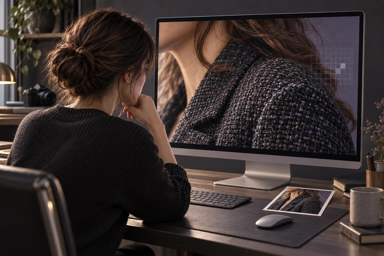
If your AI-upscaled photo looks fake, compare it with the original at the same displayed size, then inspect the downloaded output at 100%. Look for invented texture, bright edge outlines, smoothed skin, changed lettering, and altered shapes. Judge those changes separately from the increase in pixel dimensions.
An image can look more photographic while becoming less faithful to its source. Research on the perception–distortion tradeoff explains why perceived visual quality and reconstruction accuracy are different goals. It does not establish how a particular tool will perform on your photograph. Blau and Michaeli's research paper
This is a documentation-based inspection guide, not a measured test of Photo Editor AI's outputs.
Why an enlarged photo can look less natural
An upscaler must create an image with more pixels. The important question is whether the output preserves the picture's existing structures and represents uncertain detail conservatively enough for your purpose.
Inspect texture that looks too orderly, light or dark edge outlines, and smooth faces beside unnaturally crisp hair. These are review prompts; an unusual mark is not automatically an AI error.
Also check the starting file. Compression can already leave visible flaws before enlargement, so inspect a suspicious patch in the original before blaming the upscaler. Adobe treats JPEG artifacts as a distinct correction task. Adobe JPEG-artifact guide
A successful review separates preserved detail, changed detail, and detail you cannot verify. The last category matters when a small sign suddenly becomes readable or a distant face develops a precise expression.
The visual checklist for upscaled-photo artifacts
Use this table with the original and output together. It lists inspection points, not measured failure rates.
| Sign to inspect | Where to look | What would make the result unacceptable? |
|---|---|---|
| Invented texture | Hair, grass, fabric, brick, and wood grain | New repeating marks replace the source's visible structure |
| Bright or dark halos | Faces against backgrounds, rooflines, branches, and text | An outline appears or expands enough to distract at the intended size |
| Plastic-looking skin | Cheeks, forehead, under-eye areas, and hands | Visible freckles, wrinkles, or skin variation are erased or rearranged |
| Brittle detail | Eyelashes, hair strands, beard edges, and foliage | Fine features turn into spikes, wires, or disconnected strokes |
| Changed lettering | Labels, signs, dates, numbers, and logos | The output substitutes a character or invents legible wording |
| Distorted geometry | Glasses, jewelry, seams, handles, and window frames | Shapes bend, split, merge, or change their connections |
| Uneven treatment | Face versus neck, subject versus background, one person versus another | Adjacent regions have visibly incompatible texture or sharpness |
Do not use a clean thumbnail as your only acceptance check. Small previews answer whether the composition looks pleasing. They do not settle whether the lettering or a person's facial features survived.
Set up a fair before-and-after comparison
Save the original and download the actual output. Avoid evaluating a screenshot of a preview, especially if you intend to print or share the exported file.
Record each file's width and height in pixels. Those numbers confirm the dimensions of what you have, but they do not measure the accuracy of its content. For the separate task of checking a target resolution, see the 4K upscaling guide.
Start with fit-to-screen
Display both complete images in equal-sized viewing areas. Keep their aspect ratios intact and inspect any framing differences.
Check the overall scene first. Count the people and major objects. Look at skin tone, the spacing between objects, and the balance of detail. If the result changes the scene or already looks artificial here, you have a meaningful problem before zooming in.
Compare matching regions at the same displayed size
Choose the same eye, label, roof edge, or fabric patch in both files. Make that region occupy the same amount of space on screen.
When the output has more pixels, its subject appears larger at 100%. Match the displayed size separately to avoid confusing enlargement with improvement.
Use the equal-size view to judge the practical improvement. Can you follow a seam more easily? Is an already readable word still correct? Does the hair retain its direction and shape? Favor improvements you can explain with reference to the source.
Inspect each file at 100%
Select 100% or actual pixels inside an image editor or viewer, rather than changing the browser's page zoom. Inspect the output for edge outlines, local texture changes, and malformed details. Open the original at its own 100% view to establish which flaws already existed.
Adobe recommends a 100% image view when evaluating sharpness. It also explains that sharpening makes edge contrast stronger and can produce visible light and dark halos. Adobe sharpening lesson
Finally, return to the size at which someone will actually view the photograph. A tiny texture defect visible only under close inspection may be acceptable for a small personal image. An incorrect label, changed expression, or altered product shape remains a content error even when it is less obvious.
Inspect these four regions before accepting the result
1. Faces, skin, eyes, and mouths
Start with the eyes and mouth, then check facial outline, age cues, freckles, and hairline. Do this for every visible person. Count people before concentrating on the most prominent face.
Use the original to separate ordinary soft focus from lost skin texture. Do not require visible pores when the original never recorded them. Equally, do not reward a result for adding crisp pores that you cannot verify. Check whether known marks stay in their original positions and whether the mouth retains the same expression.
If the source is an old photograph, the face-preservation review guide provides a more detailed identity check.
2. Text, logos, and precise markings
Read characters against the source, including dates, decimal points, product codes, and narrow letters. Newly legible wording must still be correct.
If the original text is unreadable, mark the output's wording as unverified. Use a separate reliable reference when available; do not treat the new lettering as evidence of what the photographed object said.
For a product image, reject a version that changes the model number, label, logo, or visible construction. Better lighting or smoother edges cannot compensate for presenting a different item.
3. Fine texture and repeated patterns
Follow the same strand, seam, branch, or masonry joint across both pictures. Watch for repeating patches where the source shows irregular detail.
Use a “cannot verify” note when the input is too small to support a judgment. Photorealism by itself is insufficient evidence that the new texture matches the scene. This distinction follows the research separation between perceptual quality and reconstruction accuracy. Perception–distortion research
4. High-contrast edges and boundaries
Follow outlines around hair against sky, a dark jacket against a wall, or a window frame. Look for bright rims, double contours, and disconnected thin lines. Check whether the same effect exists in the original.
Ringing and overshoot are recognized problems in image restoration research; the Real-ESRGAN paper includes them in its degradation model. That is a reason to inspect edges, not evidence that Photo Editor AI uses this model or produces these defects. Real-ESRGAN paper
What to do when the output fails the checklist
Start from the best available camera file or scan. Label previous AI outputs clearly so inferred detail never becomes your comparison baseline.
If you added sharpening in another editor, compare a version with that adjustment reduced or removed. Change one operation at a time so you can identify which change improves the result.
Use Photo Restoration when scratches, creases, or fading are the actual task. It should not be your automatic next step for a malformed label or invented texture. Review a restored copy before deciding whether it needs enlargement.
For an image whose main problem is size, you can inspect a candidate from Crisp Upscale. Select your source, review the confirmation shown before starting, and check the result and downloaded dimensions. Assess the available controls as they appear; this workflow does not depend on a particular enlargement factor or strength setting.
| Review result | Recommended next step |
|---|---|
| Cosmetic defects appear only at close inspection; content is consistent | Check the intended display size or make a small proof print |
| Extra sharpening creates distracting outlines | Reduce that sharpening and compare again from the original |
| The source is a damaged or compressed copy | Find a better original or address the specific damage first |
| Faces, text, headcount, or object shapes change | Reject that version and try a better source or local manual correction |
| Important new detail cannot be verified | Keep it marked as uncertain; do not present it as recovered fact |
Once you have an acceptable image, choose dimensions for its actual use. The 4K-versus-8K printing guide covers that separate decision. More pixels should serve the photograph you approved, rather than become a reason to accept one you do not trust.
Frequently asked questions
Does a larger file mean the upscaling worked?
It confirms that you have a different file, not that its details are accurate. Check its pixel dimensions, then compare content at the same displayed size and inspect the download at 100%.
Can an upscaled image look better and still be wrong?
Yes. A pleasing image can contain changed expressions, invented texture, or incorrect lettering. Review recognizable features and precise markings separately from overall visual appeal.
Should I upscale an already upscaled image again?
Keep the original as your baseline. Reprocessing an output does not verify its inferred details. Only keep another version if it serves a real size requirement and passes the same content checks.
Do I need to reject every artifact visible at 100%?
Use the intended viewing size to assess minor cosmetic defects. Reject content changes such as incorrect text or altered facial features even if the smaller preview makes them harder to notice.